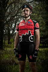
on the left is the original in-camera auto white balance. in the middle it's set in lightroom off the blacks in the jersey. on the right it's set off the whites in the jersey. anyone care to offer an opinion of which they prefer?


you can click through to see them bigger on flickr.


5 comments:
I think option 2 is my fave. Option 1 seems too cool, and option 3 is just a teeny bit too warm/pink. I think 2 is a good middle-ground.
I should say that option 3 only seems a bit more red when compared side by side with option 2. On its own, it looks perfectly good too.
i like the orig best - it's the grayest, and goes with the theme of the pic
Joe your project is turning out really cool. I think your onto something.
Crouse
Tough call. Two and three look very similar. Skin tones might be slightly truer in option 3. Did you try the eye dropper on the gray in his glove?
Bruce
Post a Comment